sunday product pages
overview
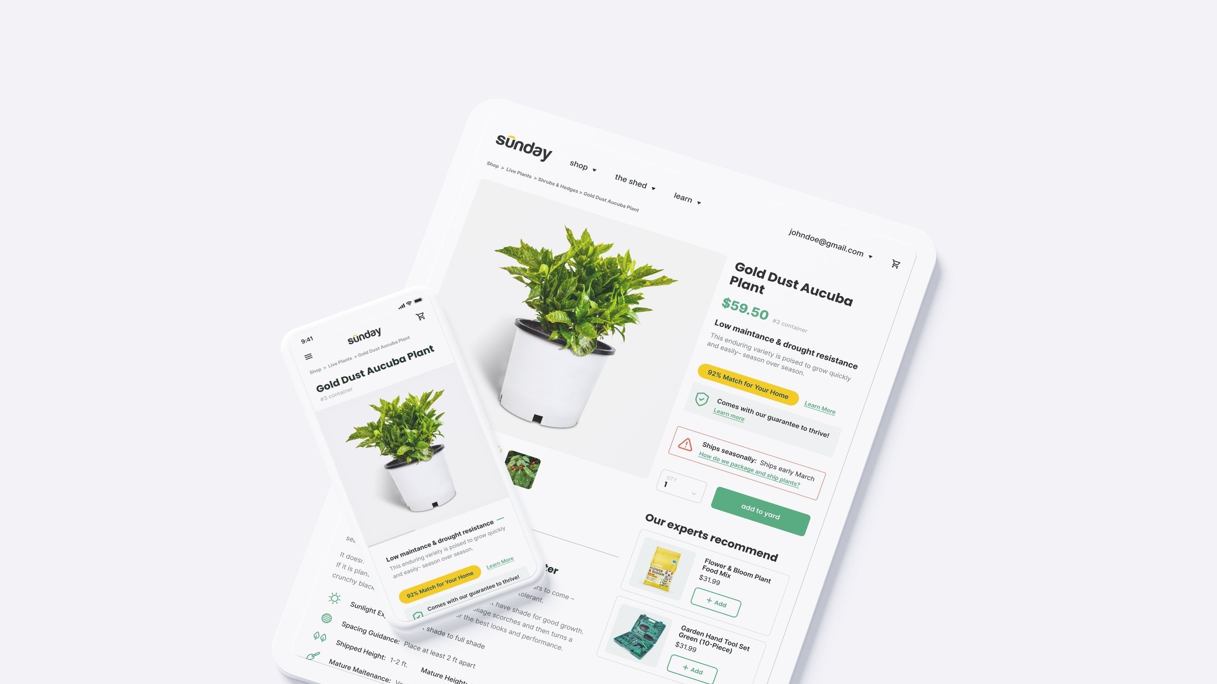
After completing the Storefront designs- we jumped straight into redesigning Sunday’s product pages. Leaning on the competitive analysis and research conducting when kicking on the first stage of the project, we were able to turn this project around in a tighter timeline.
designed and built: 2021
deliverables
Competitive Analysis
User Interface
Prototyping
software
Figma
challenge
Sunday had an existing product page design that was limited in effectively showcasing their new focus on expanding their product line to include live plants. The current design lacked the capacity to highlight the unique features and benefits of the plants they offered and recommended, hindering Sunday's ability to captivate potential customers and effectively communicate the value of their expanded product range.
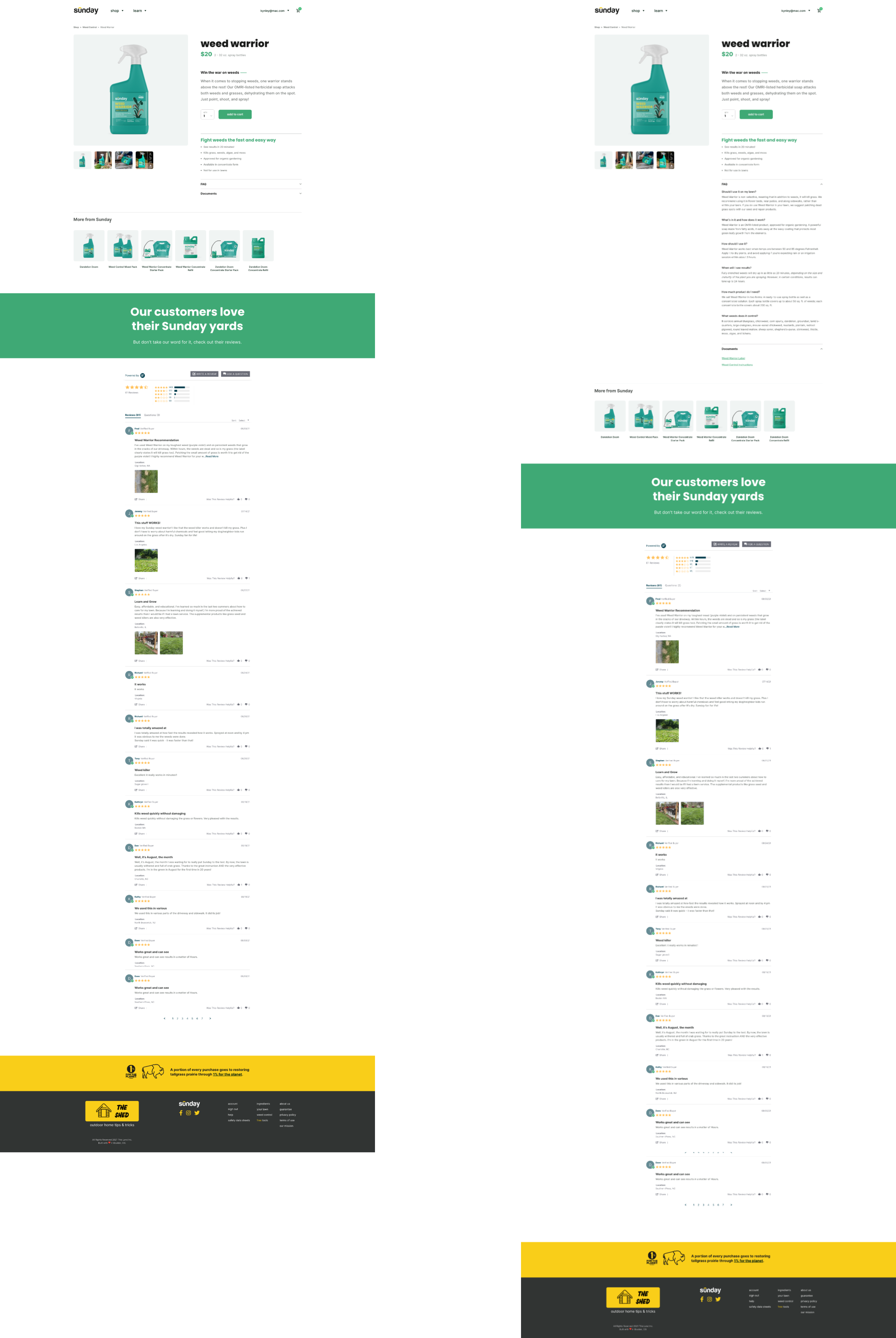
existing designs
Sunday’s existing product pages were solely focused on their chemical lawn treatments. They wanted room to feature different aspects of plants such as sun needs, growing rate, blooming season, etc. They were also looking for ways to feature more cross-sells and encourage customers to create a Sunday account.
competitive analysis
Here is a snapshot of the competitive analysis complied for Sunday (see more details here)- Fresh Product Design hosted a day long design studio session with the stakeholders at Sunday. We reviewed with them the results of our analysis and then brainstormed as a group.
A review of the full deck prepared and shared with the client can be reviewed on request.
product page comp analysis review
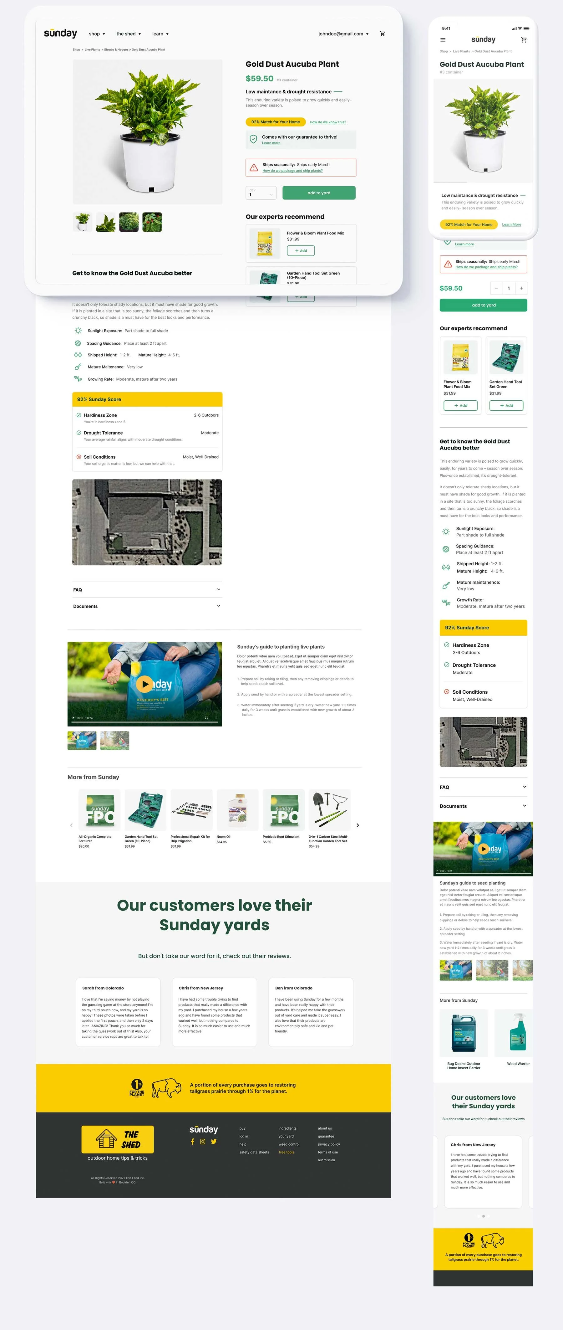
final deliverables
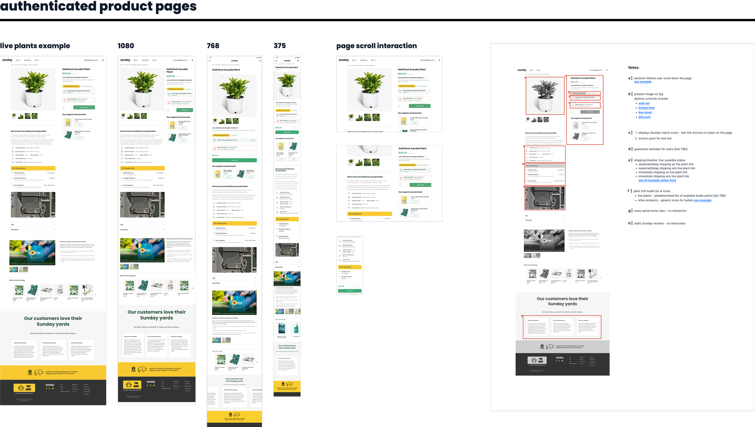
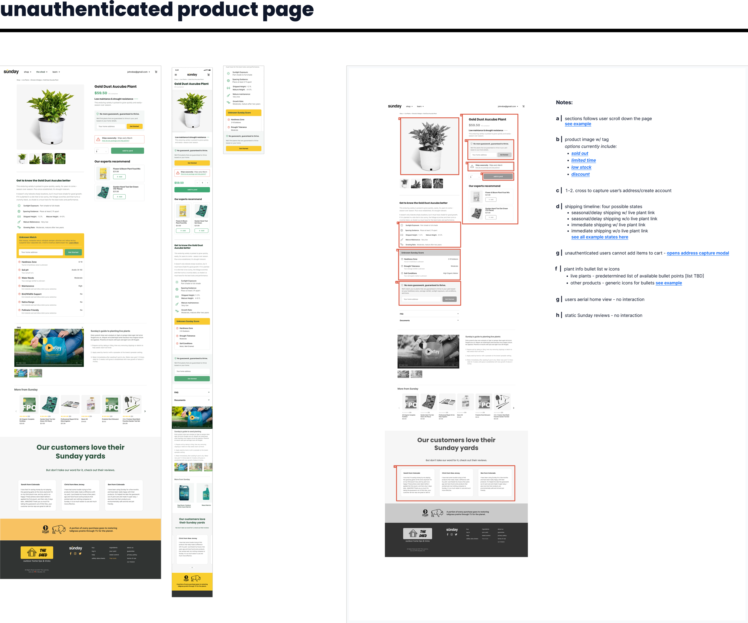
With concepts approved and the storefront designs approved- I began working through the full color designs still focusing heavily on mobile first and adaptive break points.
Just as before, I built out a user flow map with link references since I was handing off to their own internal engineering team.
